Metrio Coffee Logo
Coming up with a product logo or something that would serve as a visual identity for food items, such as coffee and other beverages, could be quite tricky. You need to incorporate the element of recall and uniqueness, so that one look at the logo or image would immediately bring to mind the product name.
On Behance, Robinsson Cravents has come up with a visual identity for Greek-based Metrio Coffee, and it is clear that it managed to achieve that goal of being unique and easily identifiable.
If there are symbols that are easily identifiable or associated with ancient Greece, olive branches and the Athenian owl would be among them. These two are exactly what was embodied in the logo for Metrio coffee.
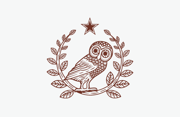
Athenian owl and olive branches.
Greeks clearly love their coffee, and they often take it “short”. Short black coffee means black coffee with only one sugar – not too sweet but not bland, either. That is where the name METRIO came from: short black coffee.
The use of the color brown is highly noticeable in the main design. Of course, other colors were incorporated when it came to the other applications of the logo design, for appropriateness.
Let us take a look at the applications of the Metrio Coffee logo or visual identity.
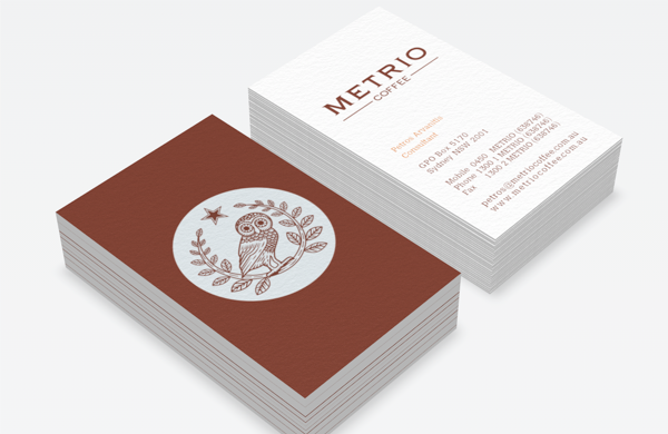
Calling Cards
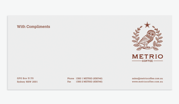
Complimentary card.
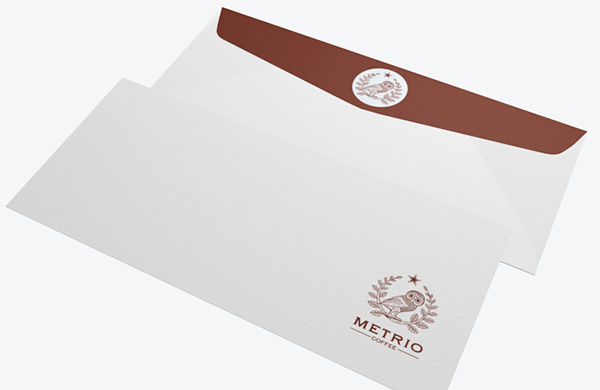
Stationery set.
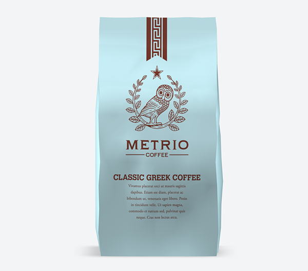
Packaging for Metrio Classic Greek Coffee.
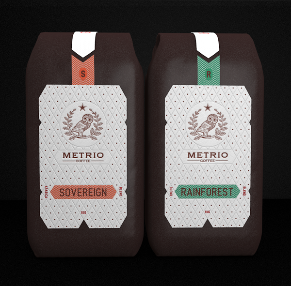
Packaging for Sovereign and Rainforest variants.
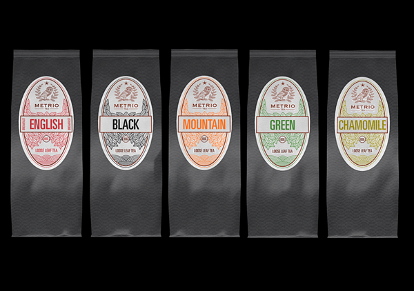
Packaging for other coffee variants by Metrio Coffee.
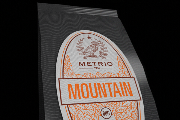
A closer look.
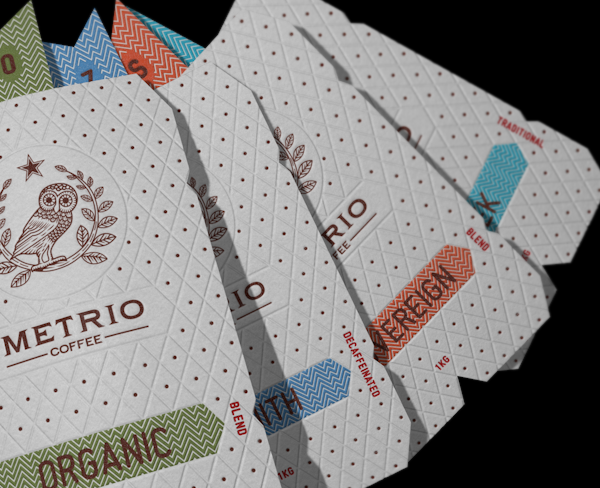
Tags for the different coffee variants.

