0
When it comes to ‘pure’ products, it is best to stick to packaging and branding design that stick close to that theme. Pure. Simple. Straightforward. You don’t want anything fancy to take away from the highlight, which is the product itself.
To showcase the Mel Ibericus Honey, graphic designers Thomas Nicholas of Chicago, IL chose to stick to the basics in designing its packaging and overall branding. Check out the images below.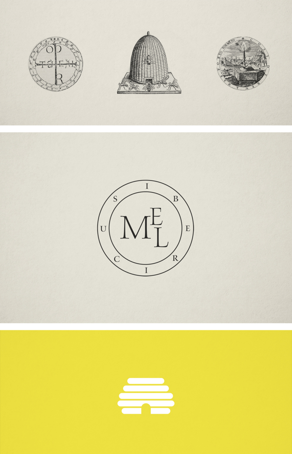
Mel Ibericus Honey Branding and Packaging
Mel Ibericus Honey packaging
When it comes to ‘pure’ products, it is best to stick to packaging and branding design that stick close to that theme. Pure. Simple. Straightforward. You don’t want anything fancy to take away from the highlight, which is the product itself.
To showcase the Mel Ibericus Honey, graphic designers Thomas Nicholas of Chicago, IL chose to stick to the basics in designing its packaging and overall branding. Check out the images below.
The creative process
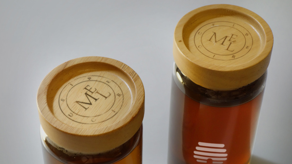
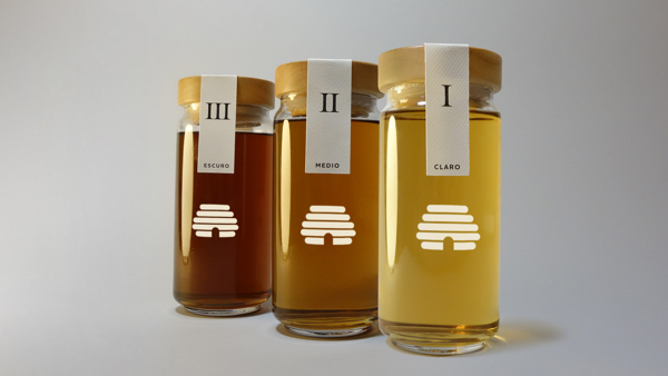
Logo on bottle covers/caps that look like they’re made from cork
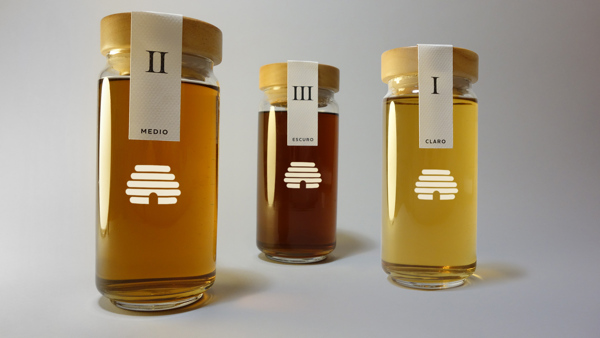
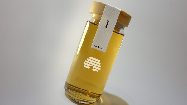
Clear glass showcase the pure honey content
Honey varieties
Mel Ibericus Honey packaging
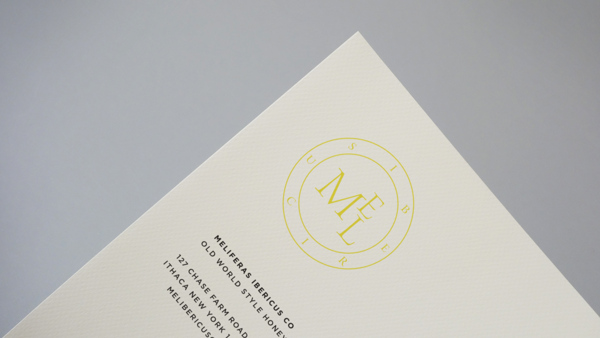
Letterhead with the Mel Ibericus logo
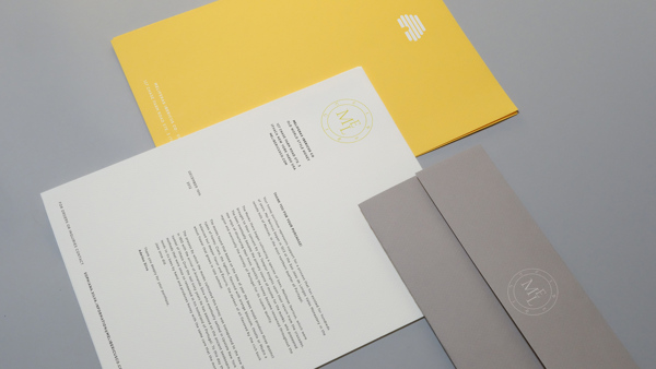
Various documents with the distinct logo
