Logo design: Iris Hotel

Logo for Iris Hotel
It is a fact that corporate identity, brand identity, and a brand or company’s overall marketing program would always need to have a very good and effective representation. It could be a symbol, a phrase, or even an image.
Logos or brand symbols should be well-thought out, since it is something that will always and forever be associated with your brand or company name. Good! Creative Marketing PR managed to come up with a refreshing take on Iris Hotel by featuring the flower, done in an origami-style.
We did mention origami, right? The Japanese art of paper folding was used as an inspiration for the logo design. Instead of taking a simple image of an iris and directly turning it into the logo, they made sure to combine origami and the image.
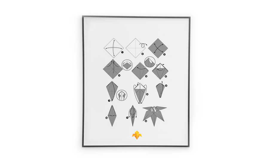
Iris, origami-style
The result? A design that is straightforward, simple, and yet VERY effective. One look, and you’ll know it’s Iris Hotel.
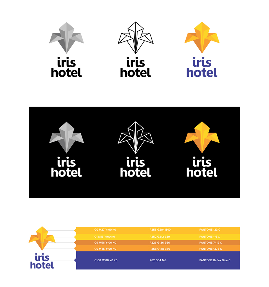
The Iris in all its glory.
As expected, this symbol will be found in main paraphernalia and tools of the Hotel, such as keycards, menus, folders, and even door signs. Set against a blue backdrop, the yellow-orange Iris definitely pops.
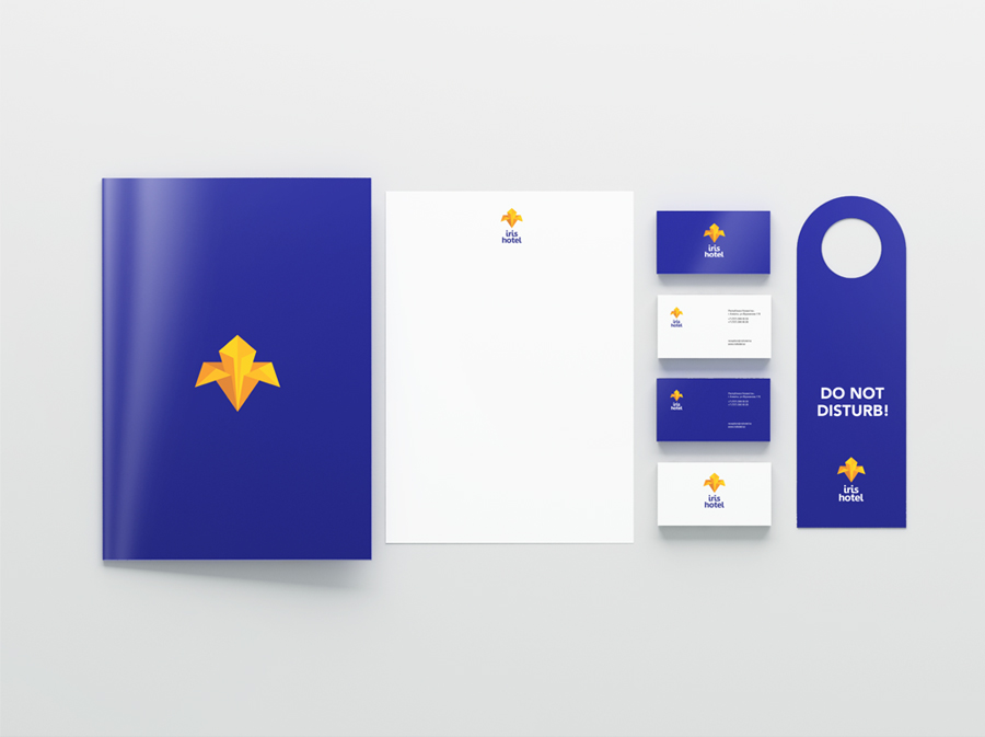
Use of the Iris Hotel logo
Other items with the logo are indicated below. Do not be surprised if you will see these yellow irises everywhere!
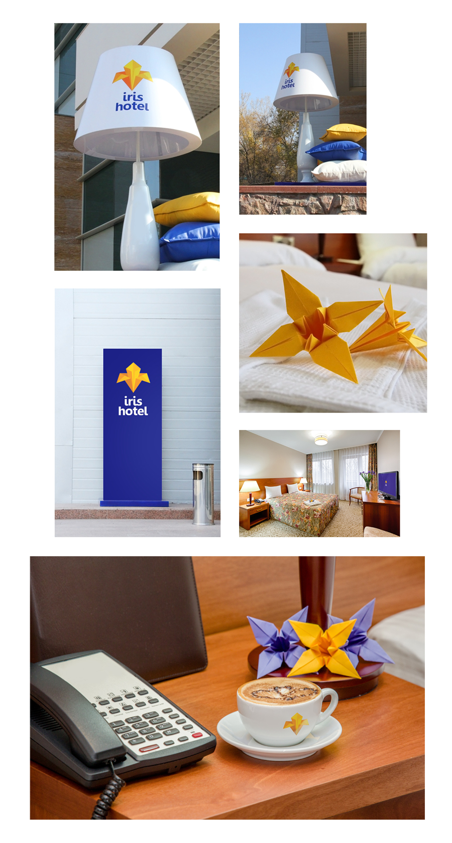
The Iris everywhere.
Even the hotel’s website has the yellow iris displayed prominently.
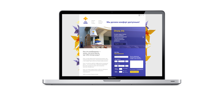
The Iris online.

This solution has been deemed correct by the post author
Is this a trademarked logo for the hotel? I do not see it being used by this company. How do I obtain permissions to use elsewhere?