Logo Design for COMECO
Comeco Logo
COMECO is short for “Corfu Meat Company”. It is a business engaged in meat processing and distribution, and is based in Corfu. To come up with a logo befitting its high standards of product and service quality, they called on Chris Trivizas to do the honors.
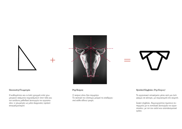
Basically, the logo design is inspired by the top view of a pig. After all, COMECO is in the business of trading and processing meat, and the best representation of that is the pig.
Inspiration for the logo
Symmetry is very important, since it evokes the company’s commitment to conducting its business in accordance with the orderly function and contemporary profile of the industry.
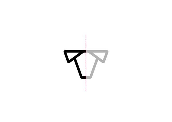
Symmetry and details.
They used a color that closely resembles that of fresh meat.
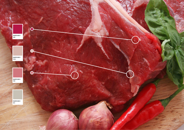
Color inspiration.
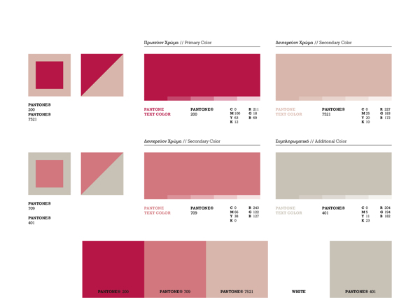
Color palette.
The typography made use of the font CANNIBAL, and expresses validity, consistency, and reliability.
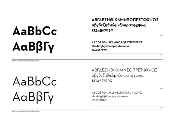
Font style: Cannibal
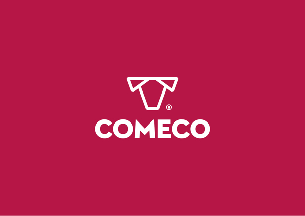
The logo against the backdrop.
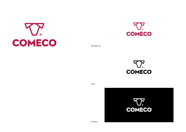
Scales.
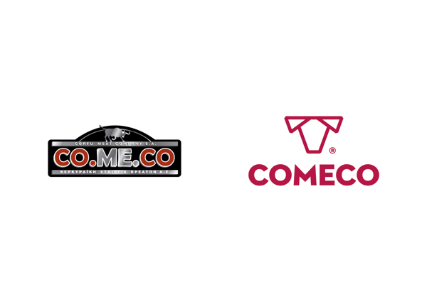
The old logo and the new logo.
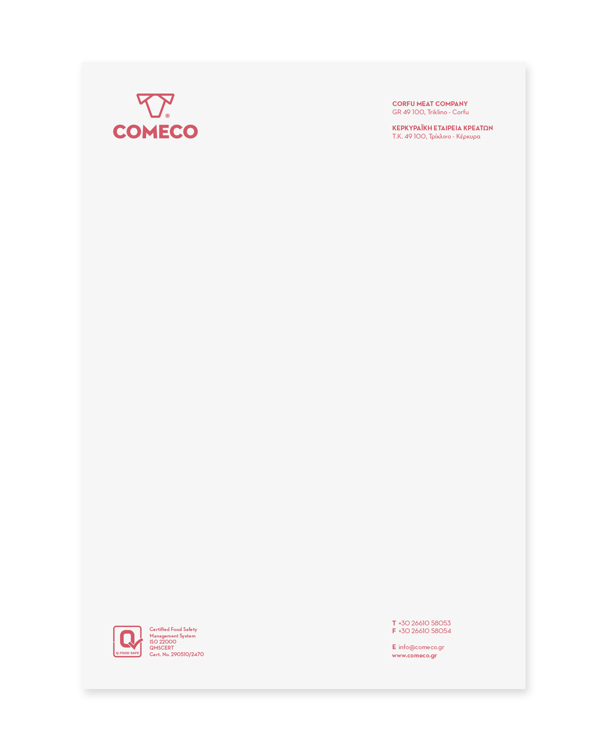
Letterhead.
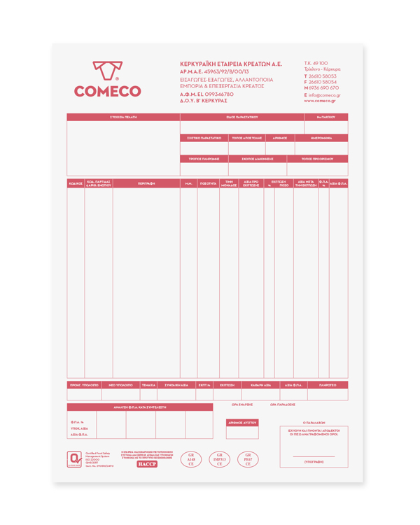
Invoice.
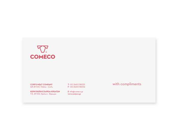
Envelope.
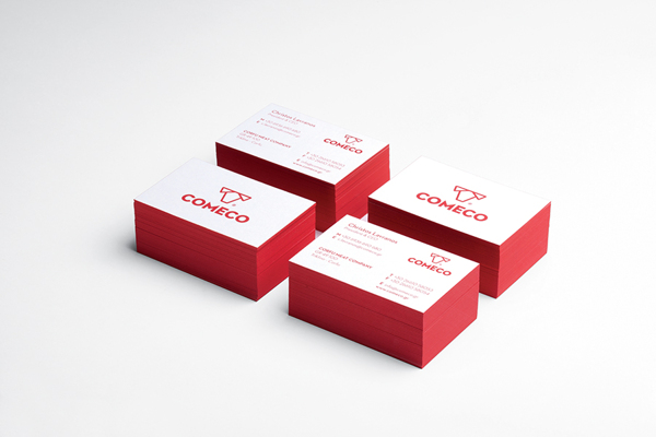
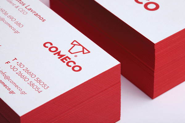
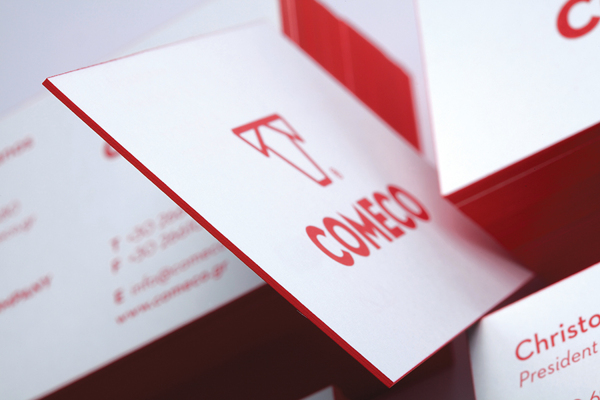
Business cards.