Andriotis Greek Olive Oil Branding
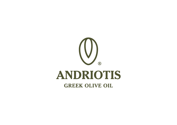
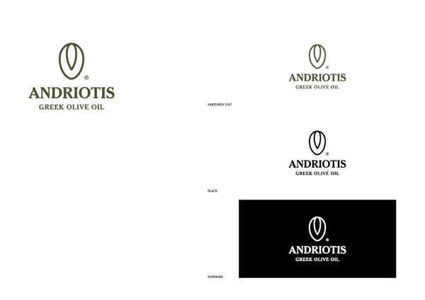
Andriotis – The final logo and brand name.
Andriotis S.A. is a family business that specialises in the trade and processing of olive oil, for the last 55 years. The logo was designed in order reflect the classic and timeless values of the brand name, while at the same time updating the communication image.
The symbol of the logo presents an olive with its pit, in section∙ the typography chosen, with serifs and capital letters, expresses the validity and reliability that characterise the Andriotis business.
In coming up with the corporate identity and branding for Andriotis Greek Olive Oil, Chris Trivizas made it a point to keep the design true to its roots, literally and figuratively, from the colors to the logo design.
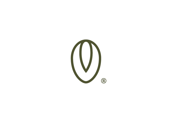
The logo starts with the shape of an olive, with the section of the pit clearly outlined.
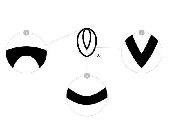
Lines are clean and straightforward.
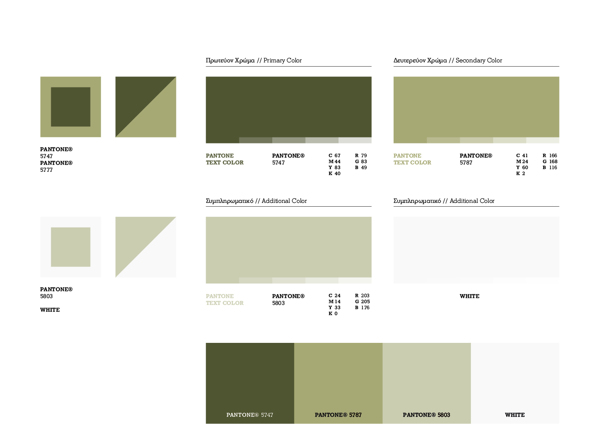
The color palette.
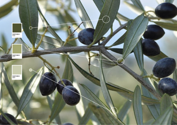
The colors stayed true to olive colors.
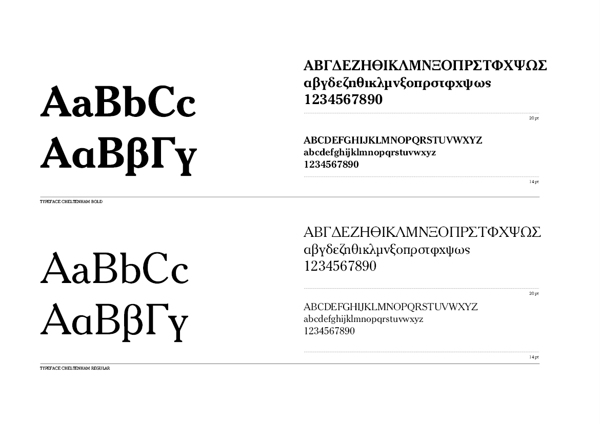
The typography chosen made use of serifs.
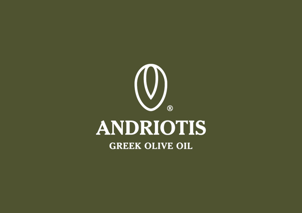
Against pantone background.
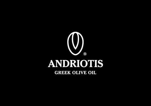
Against black background
Scales.

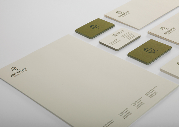
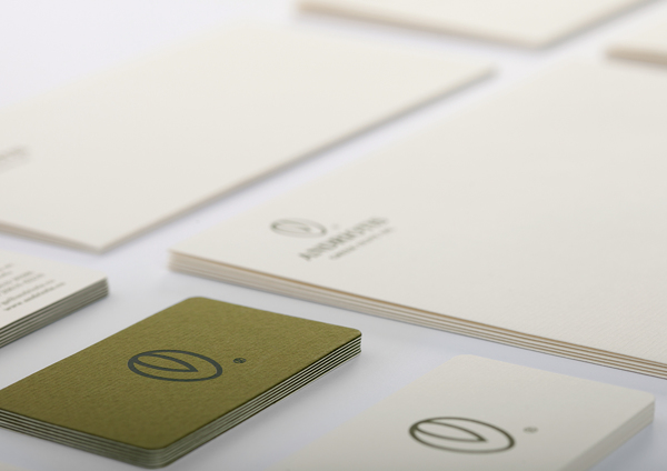
Stationery, with letterhead and footer.
Envelope design.
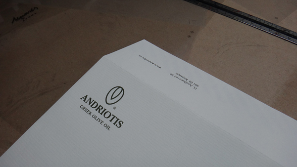
Envelope.
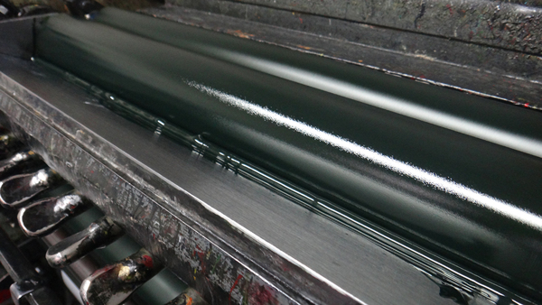
The printing process.
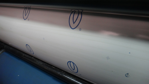
The logo in print.
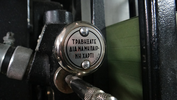
The machine used.
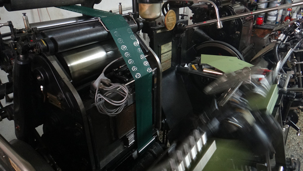
Printing the labels.
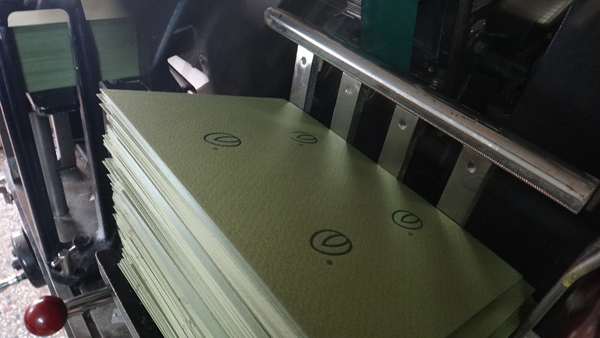
Prints.
Paper apps.
Stationery pads.
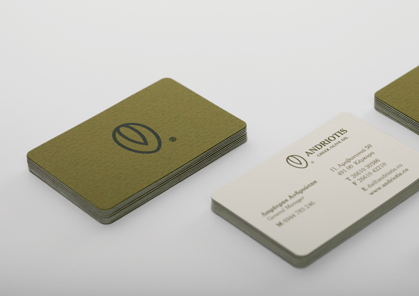
Business cards.

Up close.
