Miterra branding by Sophia Georgopoulou
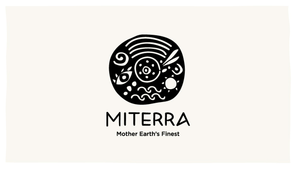
Miterra – The final logo
Miterra prides itself on bringing the market only Mother Earth’s Finest. It is a company that sources the best products Greece has to offer, and bringing them to the homes and tables of people all over the world. In the process, it maintains its commitment to shedding more light to the needs of local communities which are the source of these products, and helping them out in their quest for progress and sustainability.
This lofty ideal should be paired with a branding effort that shows all that… and more. Stepping up on the plate to do just that is graphic designer Sophia Georgopoulou.
The logo shape was inspired by the Phaestos Disk, which remains, to this day, to be one of the most famous mysteries of archaeology.
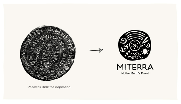
Miterra – Logo shape.
Once the shape was done, it’s time to incorporate as much details as possible, all of which mean something. As indicated in the photo below.
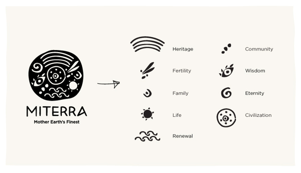
Miterra – Elements of the logo
Here are several renderings of the logo.
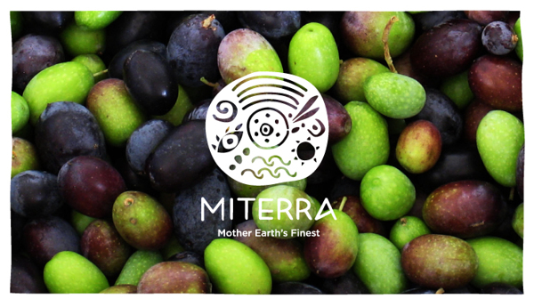
Miterra – What the logo looks like
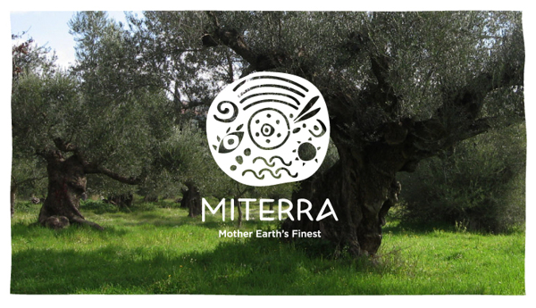
Miterra – What the logo looks like
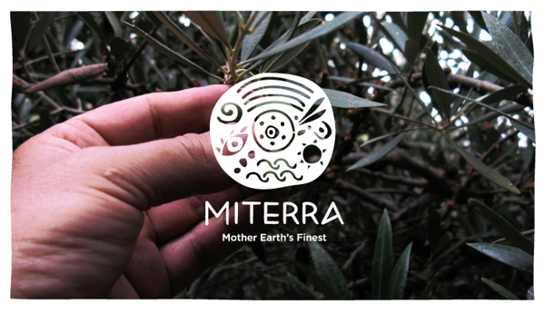
Miterra – What the logo looks like
Miterra – What the logo looks like
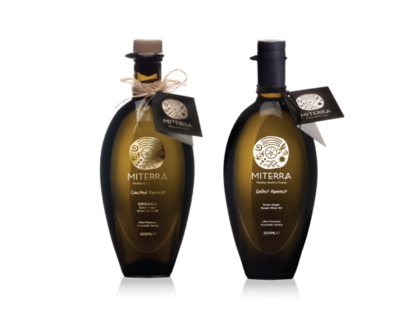
The packaging and branding of Miterra can be seen in the following photographs.
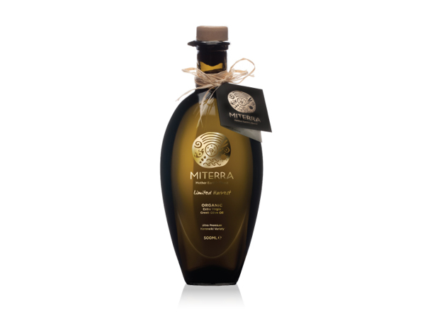
Miterra – On a bottle of olive oil
Miterra – Complete with bottle tags
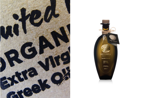
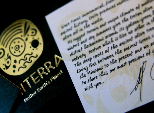
Miterra – Typography
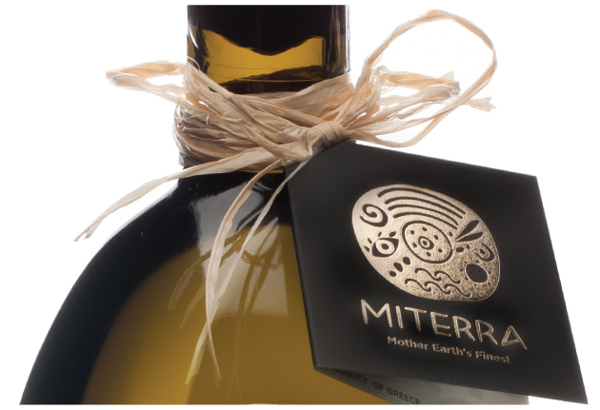
Miterra – A closer look at the tag
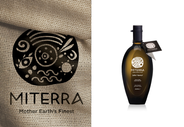
Miterra – Burlap cloth/sack
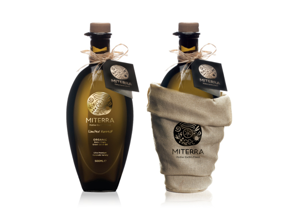
Miterra – With packaging
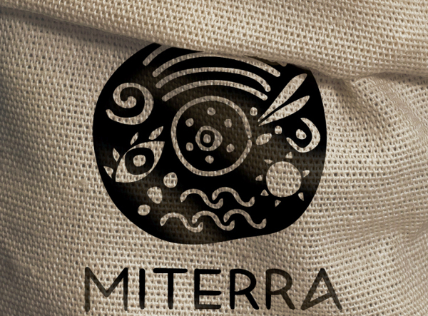
Miterra – A closer look at the bag
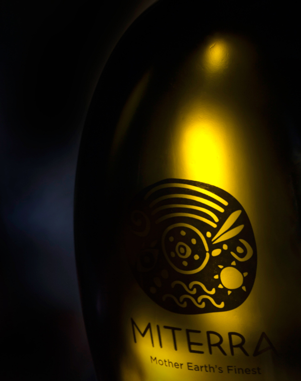
Miterra – The bottle
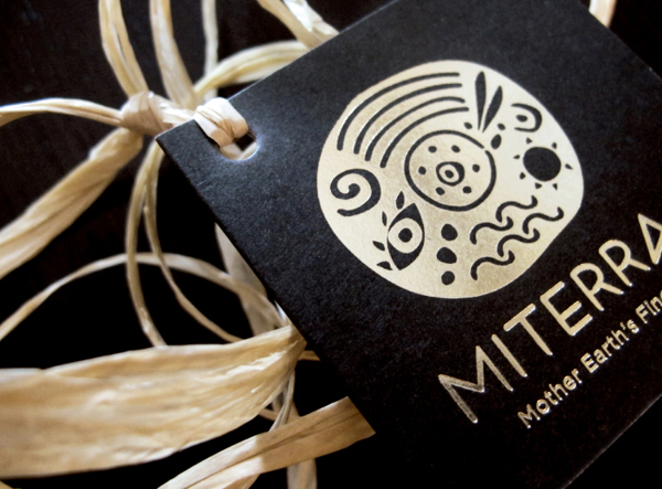
Miterra – The tags
Miterra – Creative font
