Papoutsi Vineyards

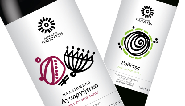
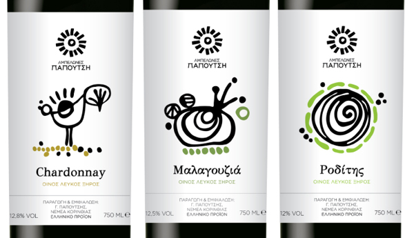
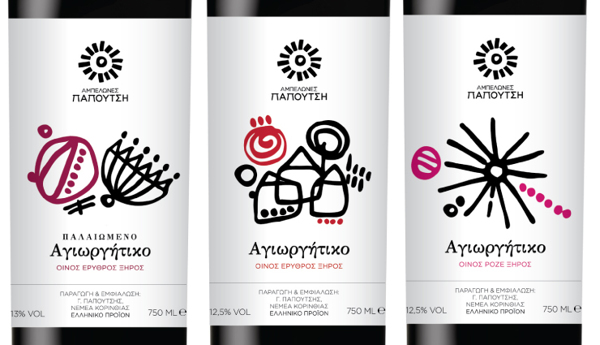
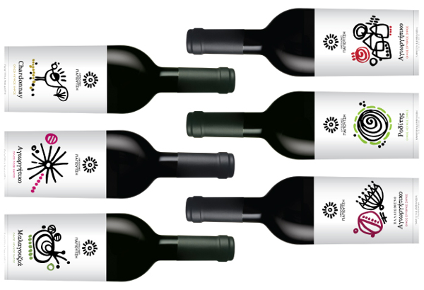
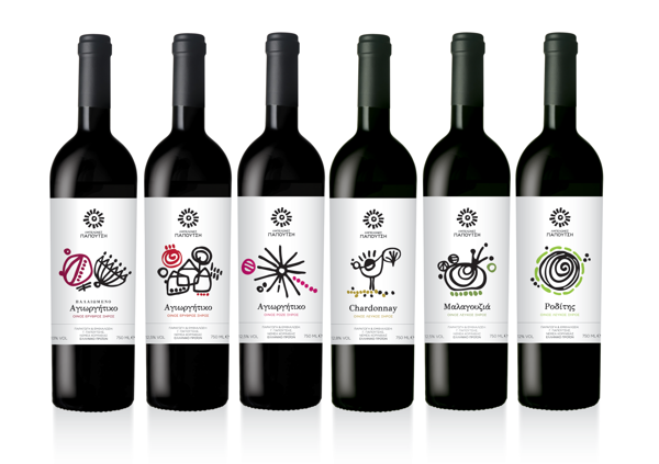
When the topic of wine crops up, “premium” and “affordable” do not seem to go together. That is a mold that Papoutsi Vineyards seem bent on breaking, and it is apparent in its branding and packaging, as designed by Sophia Georgopoulou.
When it comes to wine with premium quality available at a low price, Papoutsi Vineyards (Ampelones Papoutsi) is certainly one of the first names that come to mind. The company has its own vineyards, where premium grapes is cultivated and then processed into the high quality wine that graces your dinner table.
Papoutsi Vineyards’ goal is to ensure that every table has wine of top quality, meant to be savored together. This goal is expressed in its logo.
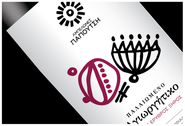
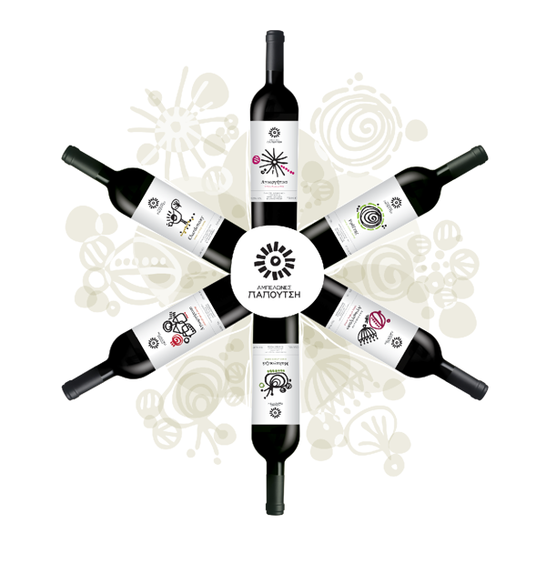
The logo’s highlight is a symbol that resembles the sun. This is a representation of the Greek sun, which is one of the elements that breathe life to every grapevine. The sun also serves as an expression of well-being, and the celebration of life in general. And what better way to celebrate life than to share a glass (or two) of wine from Papoutsi Vineyards?
In coming up with the logo and the labels, Georgopoulou made use of sketches with just the right amount of roughness to it, giving off that sense of simplicity and being down-to-earth, but still with a dash of the abstract t. Exactly what a Papoutsi Vineyards bottle of wine is all about.
