Modern Business Card Designs
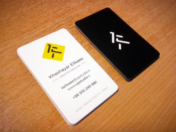
UP Studio Business cards, on laminated paper with spot UV (design by kelikaee)
Those small pieces of paper that used to contain one’s contact information have definitely come a long way as technology made things more possible – design-wise and construction-wise. In the past, business cards served only one purpose: to provide a means of staying in touch or staying connected.
However, business cards these days have become more intensely personal, more intimate, and definitely more indicative of the person or entity that owns it. Take a look at a few modern designs of business cards, ranging from the classic to the quirky, from the simple to the elaborate.
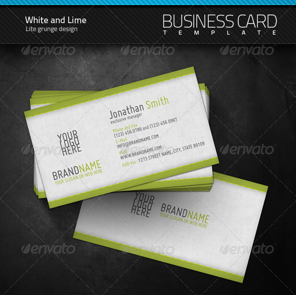
A classic template (design by artnook)
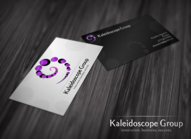
Printing logos. (design by cajoe)
Old school designs had business cards as rectangular pieces of paper of varying thickness, with the information clearly indicated in crisp, bold fonts, and perhaps a name of the company and its logo (see above photos). Now, we see the classic design being injected with more pizzazz, more color, more attitude.
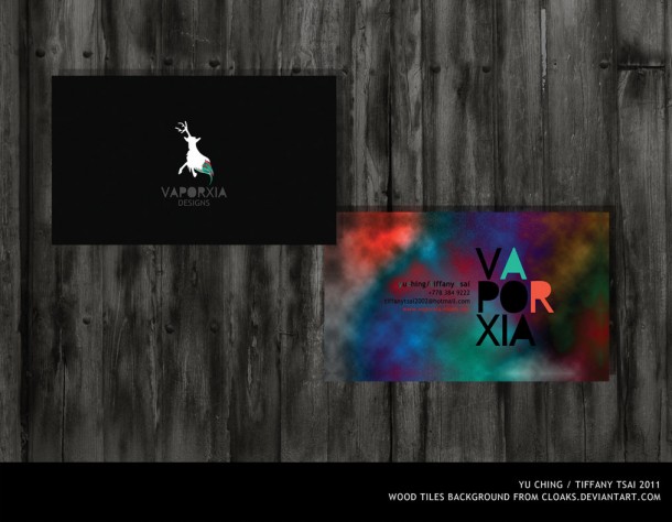
With dashes and splashes of color. (YCT business cards by tiffydoll)
Some even inject a bit of humor. Tastefully done, without going over the top.
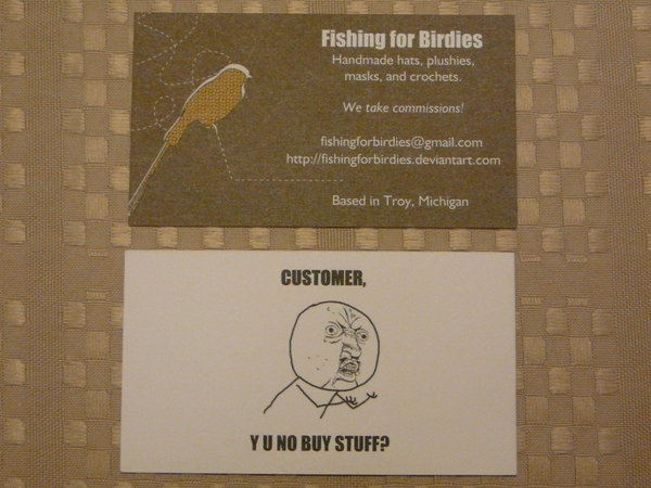
Tasteful ads added in. (design by desigg.com)
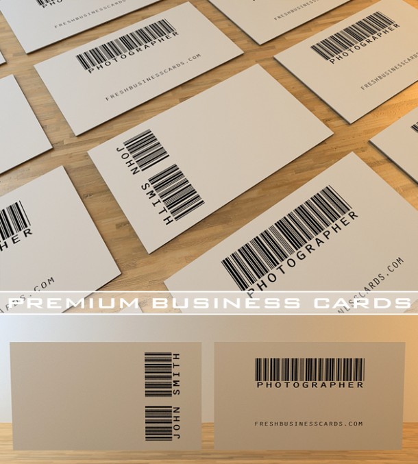
Barcode design by freshbusinesscards
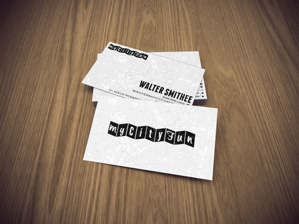
My City Fun (design by billpyle)
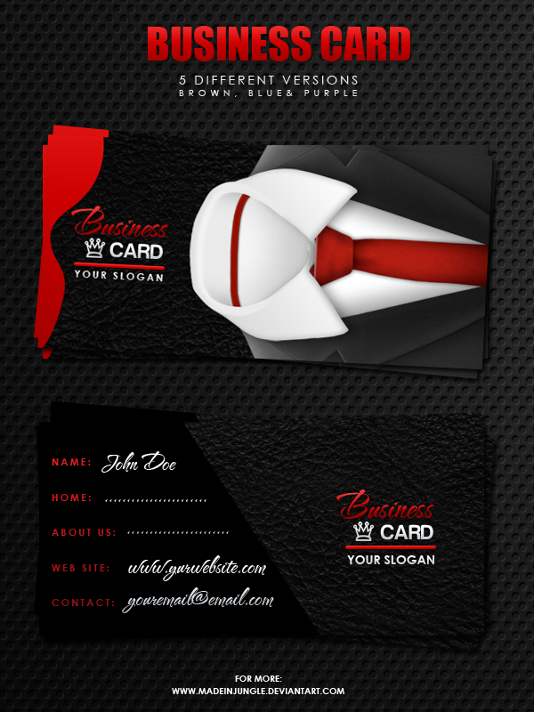
Perfect balance between fun and serious. (design by madeinjungle)
If you’re feeling more adventurous, you can take that risk and incorporate outrageous prints or designs in your business cards.
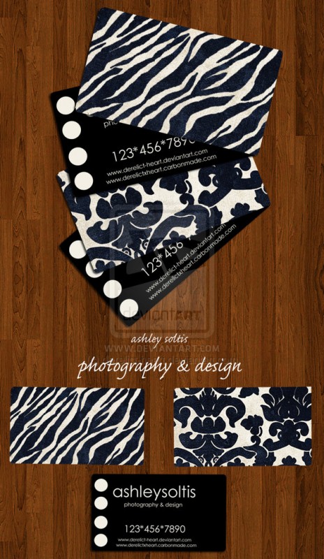
Avant garde (design by derelict-heart)
But if you truly want to express your creativity and individuality even through a business card, why not push the limits and see how far it goes? You might be pleasantly surprised.
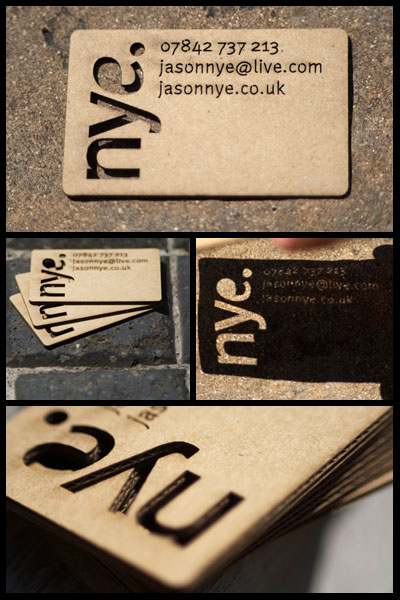
Cutouts (design by jase-nye2212)
The rule in making business cards is… there is no rule. No one said they only have to be one shape and size, right?
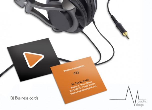
Play around with the size. (design by dmavromatis)
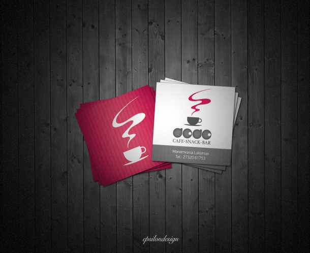
Square cuts. (design by tasos7)
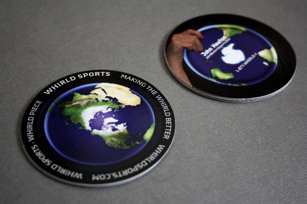
Round cards. (design by desigg.com)
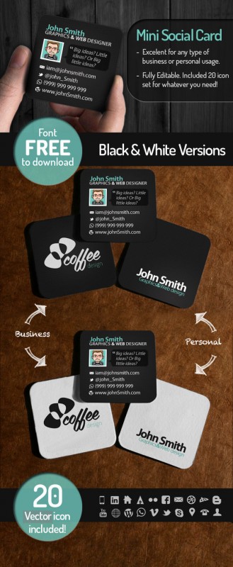
Be adventurous. (design by desigg.com)

Owl cards (design by desigg.com)
You can even try for the unconventional shapes, just to shake things up a bit.
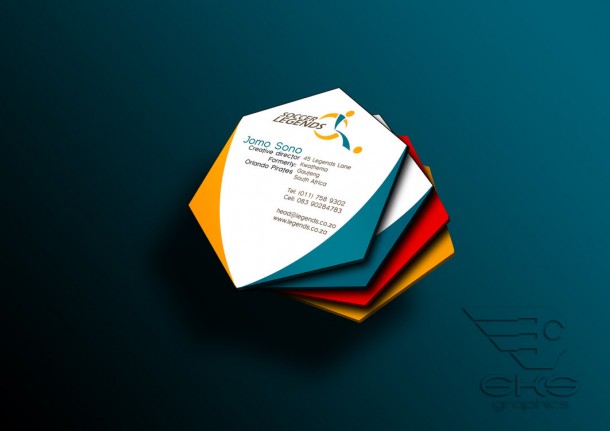
Sporty and edgy. (design by desigg.com)
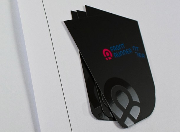
Unique cards will get more attention. (design by desigg.com)
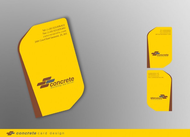
Straightforward need not be plain. (design by desigg.com)
So the next time you want to make business cards, be more spontaneous. Who knows, maybe you will have a wider network because of that!
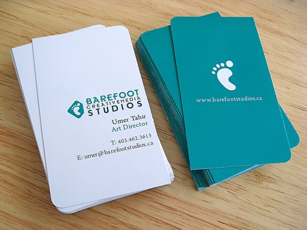
Step on it! (design by desigg.com)


