Based in Athens
Cultural spaces are not mere venues where various art forms or media are displayed. They are, in and of themselves, a backdrop that will highlight the subjects instead of swallowing them whole. Getting that balance is important when it comes to designing the logo or corporate identity for such a cultural space, and that was achieved by designer Sophia Georgopoulou for “Based in Athens”.
The cultural space is located in Athens, Greece, which partly explains the name. The logo and the typesetting is simple, but with a twist that is uniquely Greek.

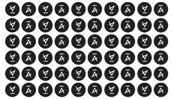
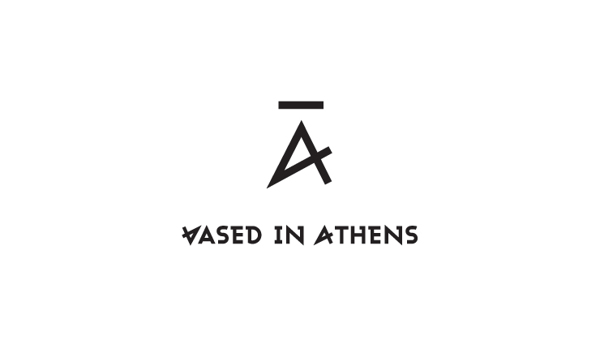
The main point of the logo is the letter “A”, the first letter in the word “Athens”. However, it is written in its archaic form.
Interestingly, when the letter “A” is flipped or turned upside down, it spells out the letter “B”, where “Based” is based on (no pun intended).
Thus, it embodies the phrase “Based in Athens” cleverly.

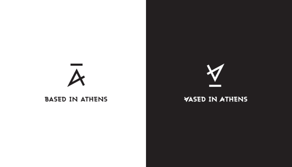
When you look closer, the letter also resembles the number 4.
This is also very fitting, since Based in Athens is meant to be a venue where four forms of cultural activities or events are to be showcased. They include exhibitions, gigs, seminars, and workshops.
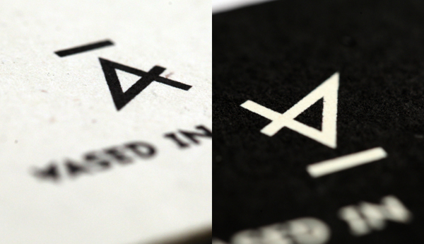

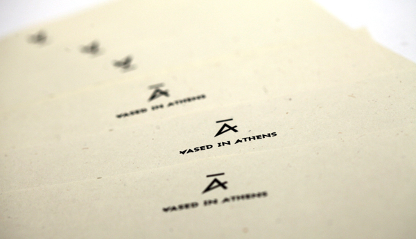
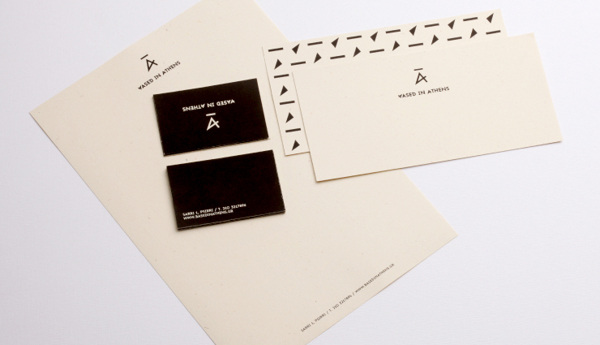
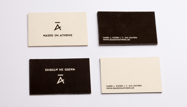
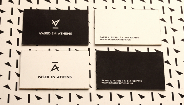
The logo is found on various items related to Based in Athens, from envelopes to stationeries and even cards.
