Packaging for Maya Chocolate from Eri Liougkou
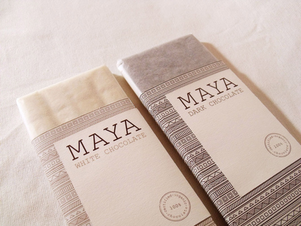
Eri Liougkou over at Behance.net has successfully come up with a packaging design for Maya Chocolate, particularly their dark and white chocolate.
The design strongly makes use of the logo of the chocolate, as well as the lines and patterns that depict Mayan culture.
One thing to note about the Maya Chocolate – both white and dark – is that they are 100% organic.
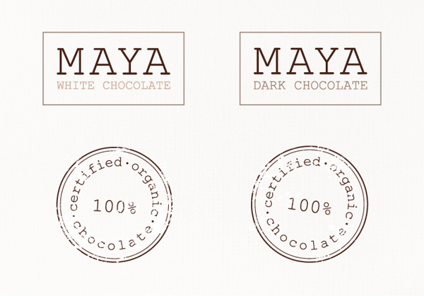
100% Certified Organic
The packaging of the White Chocolate makes use of a lighter hue of the lines, patterns and font.
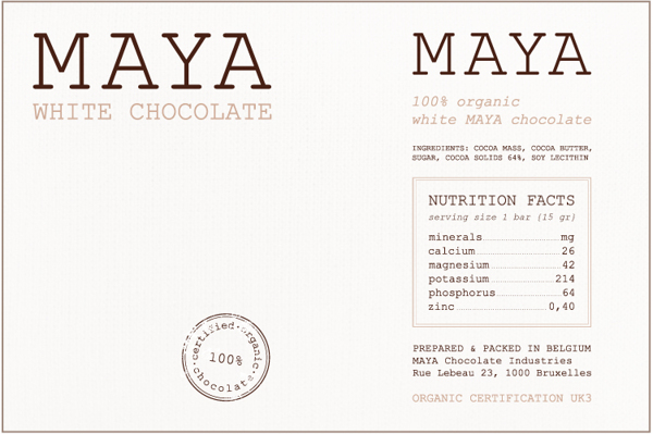
White Chocolate – lighter hues.
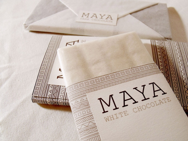
White Chocolate packet.
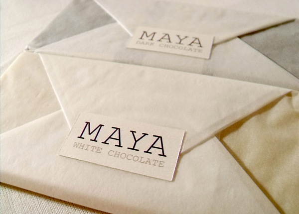
Unopened packet.
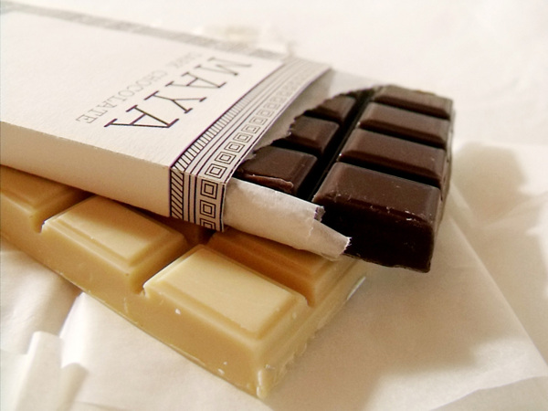
Dark and white.
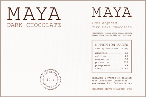
Dark Chocolate – darker hues.
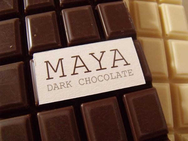
As dark as can be.
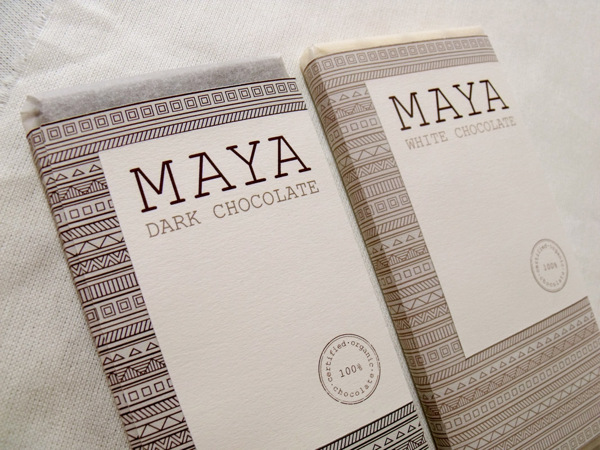
Unopened packet.
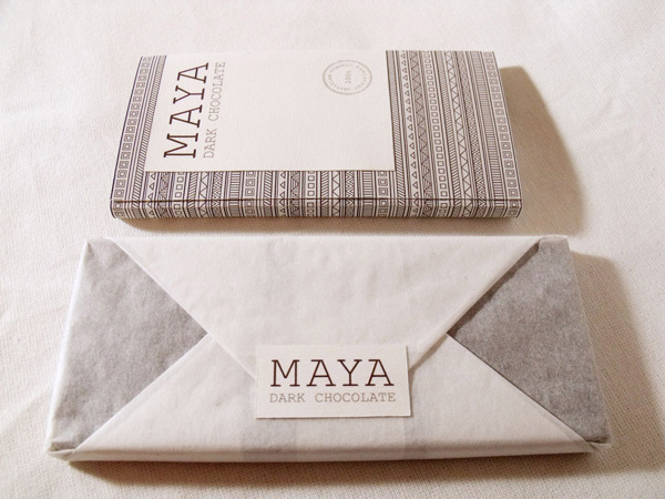
Dark chocolate in unopened state.
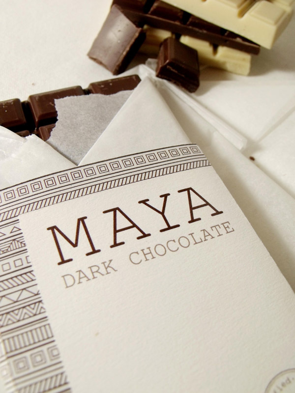
Opening the dark chocolate package.
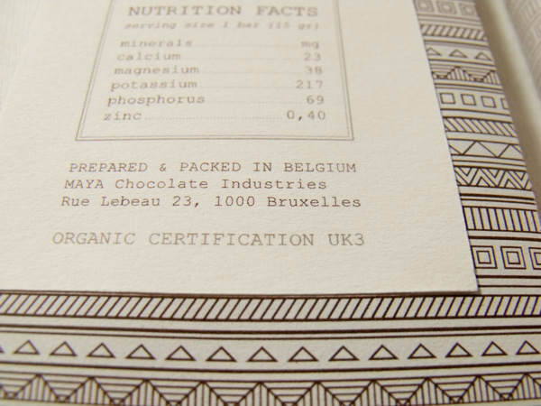
Nutritional facts at the back of the label.
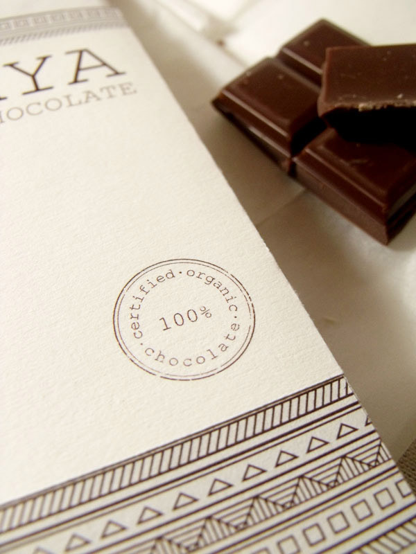
Stamp of quality.
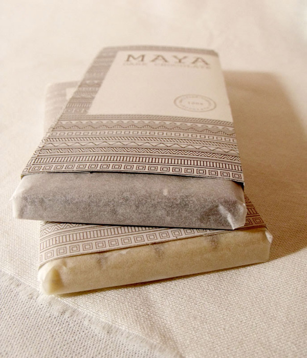
Chocolates… for your pleasure.
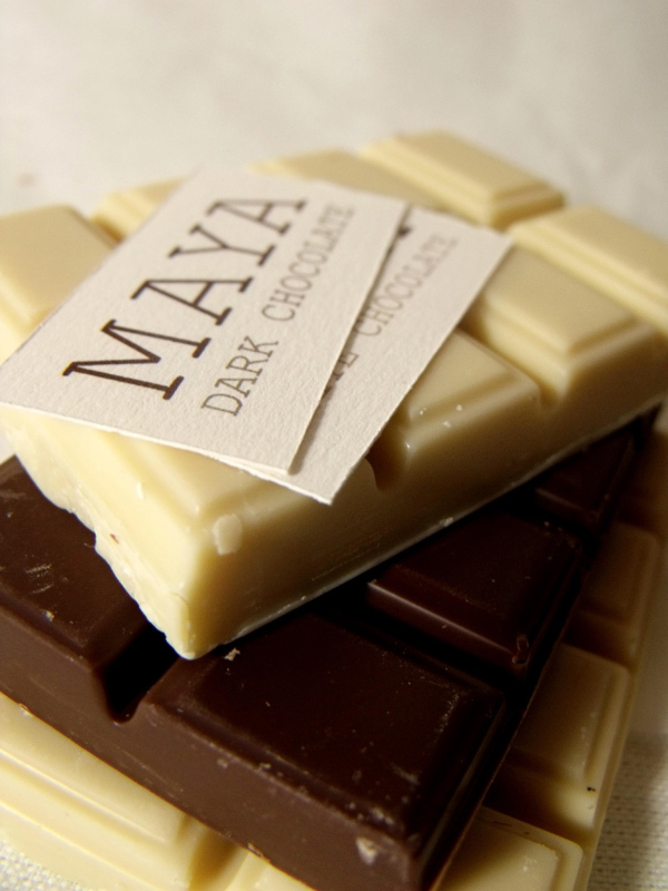
Maya Chocolate – dark and white.

