Zolotas Jewelry
Zolotas Jewelry
Jewelry brands are always tricky when it comes to coming up with logos or corporate identities for them. After all, we’re talking about an industry that is known for its intricate designs, which means the corporate identity shouldn’t be any less artistic.
The house of jewels known as Zolotas has been in existence since 1895. With the evolution of time, it was only fitting that the jewelry house also come up with a more modern approach to its brand identity. A re-branding is in order, and so the results are shown in the images below.
First, let us take a peek at the work of Zolotas so far, as presented in its catalogue.
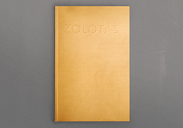
Cover of the Zolotas Catalogue
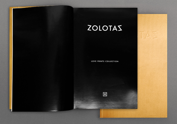
Front page.
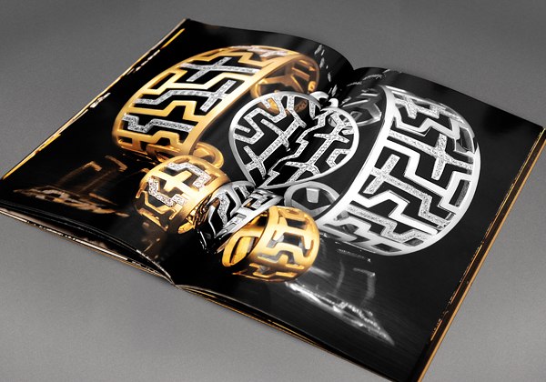
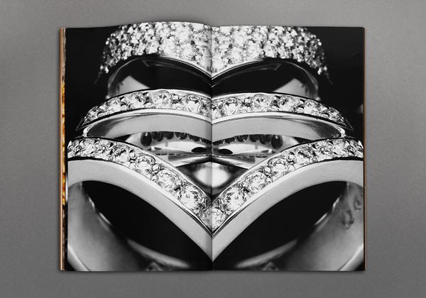
Luxurious designs for a luxury brand.
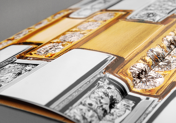
It’s in the details.
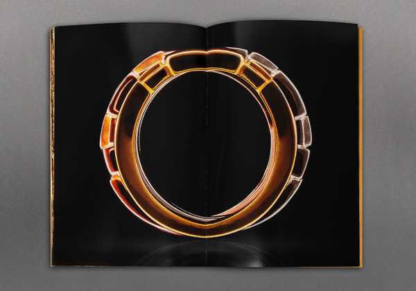
Simplicity and elegance combined.
One glance and you’ll know it’s Zolotas.
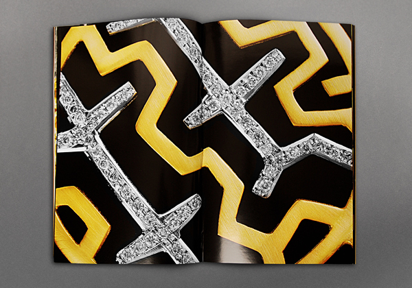
Classy and modern.
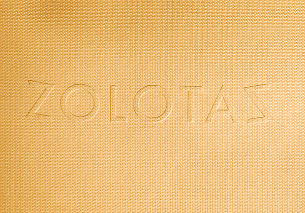
Now let’s take a look at the logo. At first glance, it looks like a Greek symbol, and you wouldn’t be far from the truth, considering that’s where the inspiration is derived from. However, if you look closely, you’ll realize that it combines the first and last letters of Zolotas (in Greek, of course).
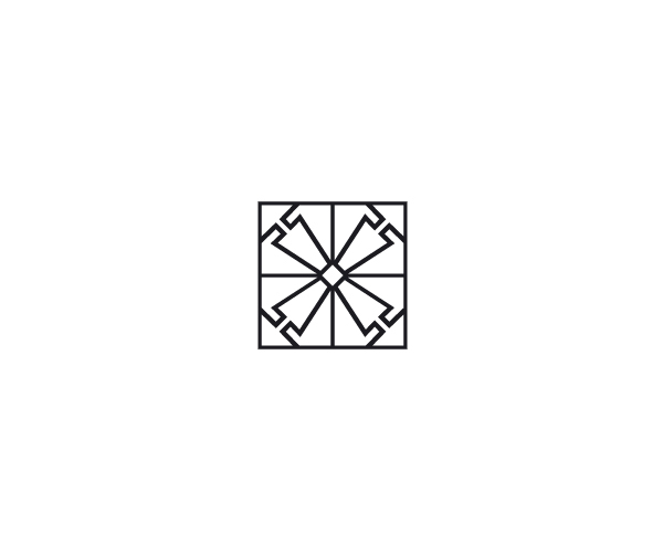
Basic concept of the logo.
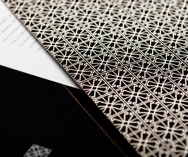
Logo as a pattern.
The font was purposefully created for Zolotas, sticking to the simplicity of sans serif typefaces.
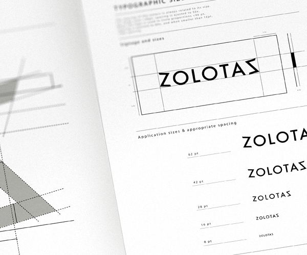
Custom sans serif font type.
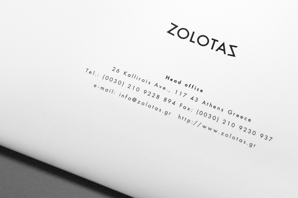
Simple yet classy.

Various applications.
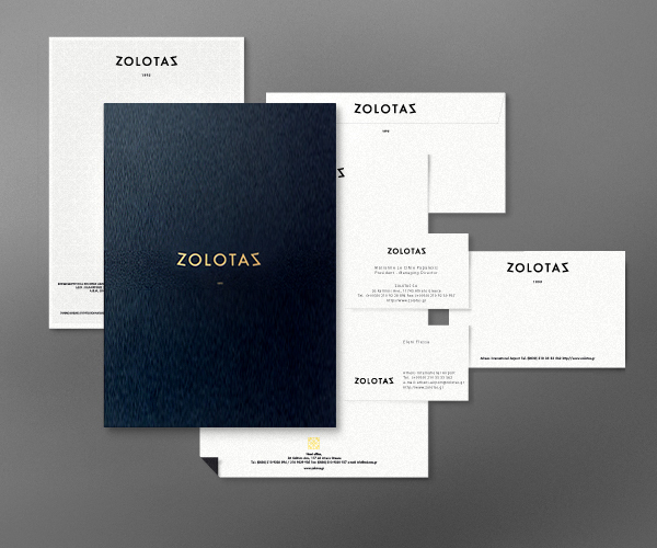
Zolotas premium corporate items.
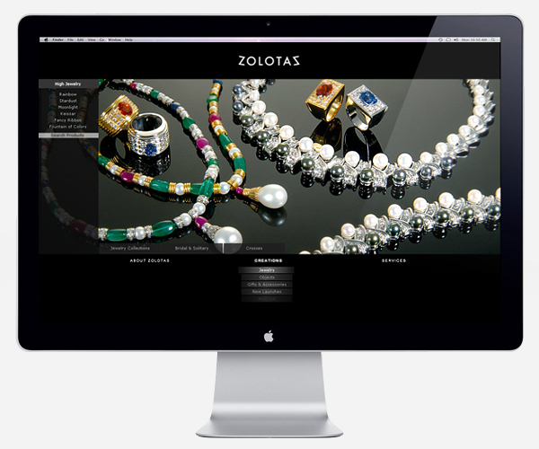
Zolotas website
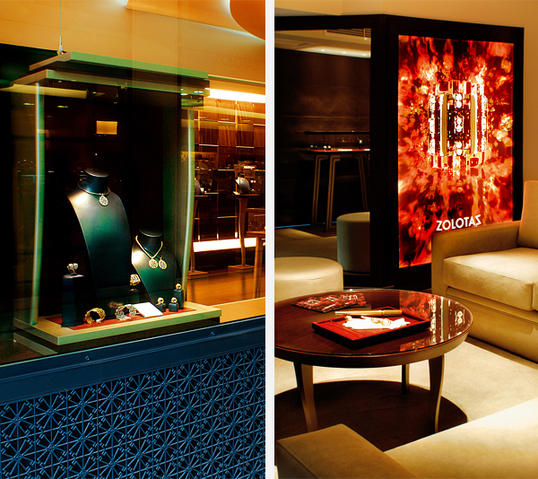
Interior of a Zolotas store.
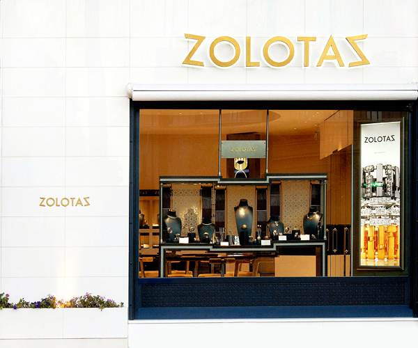
Facade of a Zolotas outlet.
